Branding is critical to business. It is your identity, sets you apart from the competition, and presents a memorable impression. This recognition increases company value, provides insight, sets expectations, and makes acquiring new customers easier.
There are several reasons why a company considers rebranding. Companies rebrand when they reposition in a market or when it experiences rapid growth. Or, over time, a brand can become dated, and that's when rebranding has to be considered.
In the case of VCTI, a combination of rapid growth and a dated image were the catalysts for new messaging, a new brand identity, and a new website.
Meet the Client
VCTI is a world-class leader in network technology. The Company offers services to enable broadband service providers to rapidly plan and optimize investments for network expansion and craft win-win public-private partnerships. They also offer service providers software and solutions to simplify operations and strengthen their path to digital transformation. A third business line provides expert technical resources to help technology companies develop complex networked and cloud products. A trusted partner to the most respected and innovative broadband service providers and technology companies globally, VCTI is a privately held, global company headquartered in the U.S. with offices in India.
The Challenge
VCTI's offerings have evolved rapidly over the past couple of years.
- The Company needed new corporate solutions and service messaging to reflect their new direction.
- They wanted a fresh look and feel to reflect the Company's growth.
- The Company wanted to attract more talent.
- The team wanted to be able to update the website easily.
"We’re at a critical inflection point in our growth, and we needed a website that better reflected they dynamism of the company and worked harder for us, giving us more customer insight, flexibility, and efficiency. Red Javelin has been our marketing partner for a while now, and from the beginning of the website project, they shared our vision for what the website could be. Red Javelin brings consistency and marketing expertise that allows us to take what we think are already good ideas and actually see them realized." Sally Hudson, CMO at VCTI
The Rebrand
Red Javelin worked closely with the VCTI team to revamp their messaging and value propositions.

VCTI wanted a new logo and a modern and bold color scheme. Here are a few of the key ideas that VCTI wanted their brand to convey.
- The logo represents the relationship between three entities:
-
- VCTI's three lines of business – broadband expansion, digital transformation of network operations, and secure delivery of cloud services.
- The tight interconnection needed between our employees, leadership, and customers to deliver customer-centric products and services.
- The mark is a modern take on a classic network icon and illustrates their core expertise – networking.
- The mark is also an interpretation of the infinity icon (∞) and suggests an infinite opportunity for growth – for the Company, its customers, and employees.
- The sans-serif font is modern and was selected to show strength and resiliency
The New Website
Red Javelin teamed with Big Orange Lab for design and development. Red Javelin managed the entire client-facing process, including copywriting, image selection, and overall project management.
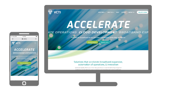
- The new site's eye-catching design invokes a sense of forward, dynamic movement, and acceleration.
- The new website borrows design elements from the new logo, including the sweeping curves and detailed linework, helping to evolve the brand further.
- Based on the goals and the opportunities uncovered with VCTI during the discovery process, the team offered recommendations to improve page structure and content organization to create consistency throughout the site.
- Simplicity was a key driver of all our design and development decisions.
- The content strategy identified gaps in the older content, and new content was created to fill the gaps. Benefits-oriented copy replaced product-centric copy.
- The easy-to-use content management system allows VCTI to create and update the content at any point to keep the site fresh and current.
Eliminated Multiple Platforms
Red Javelin recommended Hubspot's CMS, CRM, and Marketing Hub to unify the tech stack. This combination eliminates the need for multiple unrelated platforms and provides a single customer view throughout the buying journey. It offers one intuitive user interface and a unified codebase making it easy to adapt for future growth.
According to Hubspot, customers who use both Marketing Hub and CMS Hub together see 121% more contacts (leads) generated than those who use a single hub.
When data lives on multiple contact profiles, creating a cohesive buying experience for your end audience becomes difficult. When you have to choose between Powerful or Easy to Use, your team slows down.
Results
The site incorporates the new corporate branding for a modern feel. The layout is simple and provides users with valuable information quickly. The new site has a much stronger appeal to network and broadband companies, and there are clear visitor paths for both technology companies and broadband providers.
The improved back-end experience with Hubspot CMS gives VCTI the ability to update and create new pages for their site easily. In addition, the new tech stack – Hubspot CMS, Marketing Hub, and CRM gives sales and marketing a single view of each prospect, helping to shorten the sales cycle and provide an optimal customer experience.


