 One of the biggest advantages of re-branding a business is that it allows you to stay current in an ever-changing market. After all, the last thing you want is for a customer to look at your website or social media and see trends that were popular years ago, as this will show the customer that you are behind the times, making them reluctant to become a customer.
Instead, by updating your brand to fit in with current trends, any potential customers that interact with your brand will see that you pay attention to the current climate and will lead to customers thinking positively about your company.
Red Javelin teamed with Big Orange Lab to give WorkWell, a provider of musculoskeletal wellness programs for organization, a brand overhaul to reflect the Company's industry leadership and unique differentiation.
Meet the Client
WorkWell helps organizations prevent and treat sprains, strains, and back pain by delivering comprehensive and scalable musculoskeletal health programs as part of their overall safety and wellness programs. The Company partners with employers to keep employees safe, healthy, and productive by identifying workplace risks, implementing early intervention and proactive ergonomics, providing employee testing and treatment, and ensuring safety compliance. WorkWell has trained more than 10,000 highly educated credentialed PT/OT providers on their industry-leading workplace methodologies.
The Challenges
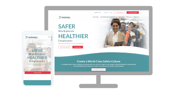
WorkWell came to us to refresh their brand and their website.
- The new CEO saw an opportunity to create a more impactful online presence that's better aligned with the Company's industry leadership and innovative, resilient spirit.
- WorkWell's website speaks to two audiences, enterprises and PT/OT practitioners looking for additional training. The new website needed to make that distinction clearer.
- The goal for the new website is to provide customers and visitors with an easier way to learn about WorkWell's services and programs.
- The Company wanted to modernize the look and feel, make it easier to navigate, more user-friendly, and guide visitors to helpful information.
- The Company wanted its visual identity to have a modern look to reflect who they are today and symbolize their dynamic future.
- The Company had a fragmented tech stack that didn't provide visibility throughout the customer buying journey - WordPress, Pardot, Mail Chimp, and Salesforce.
- The competition had already modernized its brand and digital assets.
- Last, WorkWell wanted to partner with an agency that could help fuel growth
“We love our new website! It is just one element of a fully integrated marketing program that Red Javelin has developed for us. We like the fact that our inbound and digital marketing, PR, content, social media, and sales enablement are all working towards a common goal under the direction of a fractional CMO. The Red Javelin team is very capable and responsive.” - Karil Reibold, Acting CEO at WorkWell
The Rebrand
Red Javelin worked closely with the WorkWell team to revamp their messaging and value propositions. The old website strictly focused on an ROI message that didn't resonate strongly with their primary personas – EH&S management, HR, and Risk Management. Red Javelin re-crafted their messages and value propositions to engage primarily with the decision-maker - EH&S, with HR and Risk Management as secondary targeted personas.
![]() After several creative iterations, WorkWell chose the phoenix because it is a symbol of hope and safety.
After several creative iterations, WorkWell chose the phoenix because it is a symbol of hope and safety.
- The new logo symbolizes safety and caring, reflecting their mission to help companies create a world-class safety culture by managing their most valued assets - their employees. The phoenix's upward motion is a visual representation of the importance of treating employees throughout their entire employment journey - before, during, and post-employment as they transcend to future success.
- The phoenix also symbolizes knowledge and communication. WorkWell's industry-leading provider training keeps our PTs/OTs informed and educated so that they deliver the best outcomes for their clients.
- The phoenix also symbolizes overcoming adversity. Being able to move without pain is critical to an individual's productivity and livelihood. WorkWell's musculoskeletal wellness solutions are a vital component of any world-class safety program and contribute significantly to employees' productivity, health, and wellbeing by reducing risk, boosting morale, and creating employee trust.
Eliminating the Cobble Tax
Red Javelin recommended Hubspot's CMS, CRM, and Marketing Hub to unify the tech stack. This combination eliminates the "Cobble Tax" - siloed data. The solution provides a single view of the customer throughout the buying journey, offers one intuitive user interface and a unified codebase making it easy to adapt for future growth.
According to Hubspot, customers who use both Marketing Hub and CMS Hub together see 121% more contacts (leads) generated than those who use a single hub.
When data lives on multiple contact profiles, it becomes very difficult to create a cohesive buying experience for your end audience. When you have to choose between Powerful OR Easy to Use your team slows down. They either have the tools they need but it’s very technical / time consuming to maintain OR they get set up quickly in software that they end up outgrowing. And when you need to make changes to that setup it’s very difficult to do when you’re working out of multiple codebases. If you change something in one you have to change it in another.
All these things add up to a cobble tax, or a tax on scale.
The New Website
Red Javelin teamed with Big Orange Lab for design and development. Red Javelin managed the entire client-facing process, including copywriting, image selection, and overall project management.
- Based on the goals and the opportunities uncovered with WorkWell during the discovery process, the team offered recommendations to improve page structure and content organization that would create consistency throughout the site. Each page would be created with a purpose and call to action.
- The new website borrows design elements from the new logo, including the sweeping curves and detailed linework, helping to further evolve the brand.
- To achieve a friendly UX, we incorporated a very modern design with eye-catching imagery and videos, responsive to any device type. Extra attention was given to selecting imagery. Images were selected to create a sense of empathy, wellbeing, and trust.
- Simplicity was a key driver of all our design and development decisions. We wanted to quickly segment enterprise customers from PT/OTs looking to further their education. PT/OTs are directed to a learning management system for training ad courseware.
- The content strategy identified gaps in the older content, and new content was created to fill the gaps. Benefits-oriented copy replaced product-centric copy.
- The easy-to-use content management system allows WorkWell to create and update the content at any point to keep the site fresh and current.
Results
WorkWell now has a "sales-ready" website that represents their brand and the important work they do. The new website has been fully integrated with SEO, is mobile-optimized with a modern design, has streamlined navigation, and has a robust resource library that houses the large offering of resources. The improved back-end experience with Hubspot CMS gives WorkWell the ability to update and create new pages for their site easily. In addition, the new tech stack – Hubspot CMS, Marketing Hub, and CRM – gives sales and marketing a single view of each prospect, helping to shorten the sales cycle and provide an optimal customer experience.